When the calendar flips to October, there is a natural urge to bring the magic of the changing season indoors. But styling an upscale, editorial autumn doesn’t mean you have to surrender your home to cheap, bright plastics or strip away your personal color identity.
Autumn is one of the most creatively liberating times of the year to explore color theory. You absolutely do not have to banish orange or green—two of my personal favorite hues—to achieve a sophisticated look. The secret lies in selecting deeper, complex variations of these classics and layering them with tactile, light-absorbing textures.
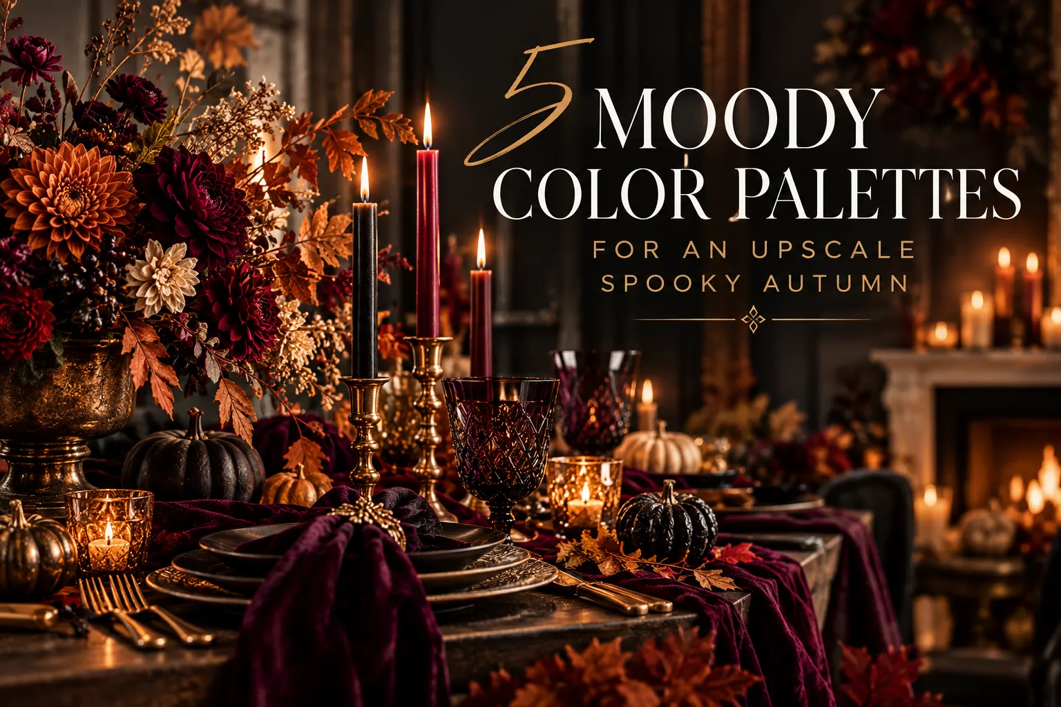
Here are five sophisticated, moody color palettes designed to bring a high-end, gothic romance vibe to your next house party.
The Gothic Romance (Deep Plum, Burnt Rust, & Antique Cream)
This palette balances heavy, dark drama with crisp, warm highlights. Deep velvet plum acts as a luxurious base layer, while a rich, burnt rust orange infuses that essential autumn warmth. To prevent the room from feeling completely swallowed by darkness, anchor the display with pops of soft antique cream.
- How to Style It: Establish your Anchor Layer by draping deep plum velvet fabric across your dining surface. Introduce the rust orange and cream through rich, deep-colored floral arrangements and tall, slender taper candles.

The Enchanted Woods (Moody Sage, Deep Charcoal, & Dark Terracotta)
If you want an atmospheric look that honors the natural world, combine an earthy green with a heavy, urban gray. A moody sage or dark olive green pairs beautifully with rich charcoal black. Injecting a dark, sophisticated terracotta orange ties the entire design back to the October landscape.
- How to Style It: Use heavy, dark charcoal stoneware plates as your place setting foundations. Introduce the green through wild, sprawling eucalyptus centerpieces, and bring in the terracotta through matte-finished ceramic vases or candle bases.

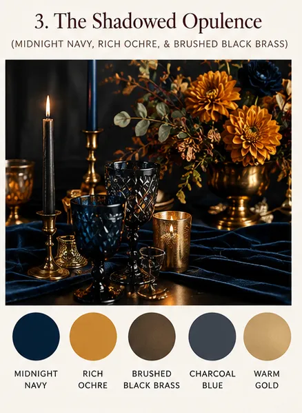
The Shadowed Opulence (Midnight Navy, Rich Ochre, & Brushed Black Brass)
Midnight navy is an incredibly underutilized autumn base color that brings an instant late-night, castle-like atmosphere to a room. When paired with a moody yellow-gold or rich ochre, the contrast is stark and deeply dramatic.
- How to Style It: Use navy blue tinted glassware to catch the light on a kitchen island. Anchor the entire look with your metallic hardware elements, utilizing heavy candelabras finished in a gorgeous antique brass that looks brushed with black mixed in.
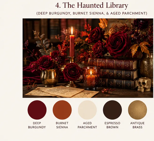
The Haunted Library (Deep Burgundy, Burnet Sienna, & Aged Parchment)
Inspired by the dark academia aesthetic, this palette leans heavily into rich, literary textures. A deep, blood-red burgundy serves as the moody base, while a burnt sienna orange grounds the palette. Muted, yellowed parchment tones act as the perfect illuminating accent.
- How to Style It: Stack vintage leather-bound books on their sides to act as your Lift Layer platform. Thread deep burgundy roses and dark orange taper candles across the mantelpiece, utilizing the aged paper tones for custom graphic food labels or menu cards.
The Monochromatic Eclipse (Matte Black, Smoked Gray, & Vibrant Velvet Crimson)
For the ultimate theatrical statement, lean into a near-total blackout scheme. Layering different sheens of black—such as matte paint, smoked glass, and glossy stone—creates incredible depth. Introducing just one single rich accent color, like a vibrant velvet crimson red, creates a spectacular visual shock.
- How to Style It: Spray paint mismatched thrift store candle holders with a high-quality matte black paint. Introduce the smoked gray through transparent glassware, and let a singular, deep red floral arrangement or a luxurious velvet runner serve as the undeniable focal point of the room.

The Designer's Rule of Thumb for Moody Palettes
When executing these dark palettes at home, remember that true depth relies on how your materials interact with light. Pair heavy, light-absorbing deep velvet fabrics with reflective elements like tinted glassware. This contrast ensures your colors look rich, complex, and intentionally styled rather than flat or overwhelming.
A Note About the Images: Some of the imagery in this post was created using AI for illustrative and creative inspiration. The color palettes, styling concepts, and recommendations are my own.